
The inspiration we get from the new spaces we experience is one of the reasons we travel. It's even better when we can translate that inspiration from our travels into our own homes.
Karen Sealy is principal designer of Sealy Design Inc. and TV design expert on Cityline. She's also an avid traveler, who shares her love of travel and design expertise with us. Here's her take on stunning 'Fifth Walls' and how you can take that travel inspiration into your own home.
Ceilings can create the overall feeling of a space as much as, if not more than, many other decorative details. Truly inspired design includes ceilings as a 'Fifth Wall'. Too often, it's more like a 'Forgotten Fifth Wall'. So many ceilings end up with default crown moulding – not very inspired! Here are some of the most inspired ‘fifth walls’ I’ve encountered on my travels, and how you can take these uplifting design tips from magnificent places you can visit… into your own home.
Fallingwater, Pennsylvania
Frank Lloyd Wright’s architectural masterpiece Fallingwater was once a private home, but is now a destination preserved for future generations of design lovers to visit. It is an entire lesson in the use of ceilings to set the atmosphere of a room.
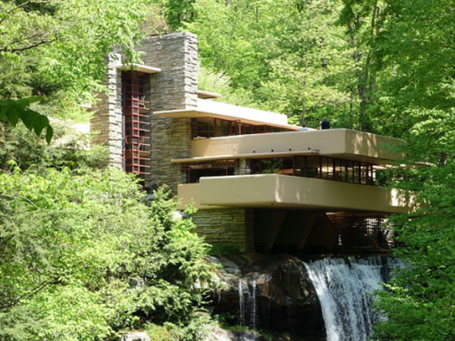
(Photo Credit)
Cathedral ceilings create a sense of grandeur and openness, perfect for great rooms or other large spaces, but used in a smaller space where you might want a cozier appeal it will feel like you are sitting in an elevator shaft. Frank Lloyd Wright famously used ceiling heights to create moods. It’s not always about lofty ceilings. In many cases, lowering the ceiling to offer a space to rest was a design device he used to make people in the space feel safe and secure.
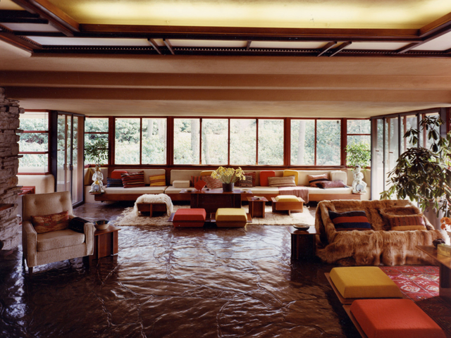
Frank Llyod Wright’s Fallingwater- Living room, looking south. Photo: Robert P. Ruschak, courtesy of Western Pennsylvania Conservancy
As someone who has always been inspired by Frank Lloyd Wright’s design it struck me how different it felt to be at Fallingwater, rather than to just see it in print. Even large open rooms had a sense of intimacy and the entire space worked as a cohesive unit as you moved from one space to the next. I adopted many of these techniques in my own home. Opening the ceiling in the living room and adding wood clad collar ties, with subtle lighting above created drama and interest and then in the neighbouring dining area, I specifically lowered the ceiling over the wrap around banquette to create an intimate area for lounging and conversation.
King Edward Hotel, Toronto
There’s been a great revival of the coffered and tray ceiling. We often associate these details with a more traditional aesthetic (which is where these ceilings have their roots) but modern choices, such as linear, less “fussy” details and painted versus natural wood, work in most transitional homes.
This ceiling (top photo and below) in the historic King Edward Hotel, in Toronto, is majestic and elegant, and even feels current. By painting it white it has a more reflective quality that bounces light from the both the magnificent, traditional chandeliers and the very modern uplights creating an airy and ethereal feeling.
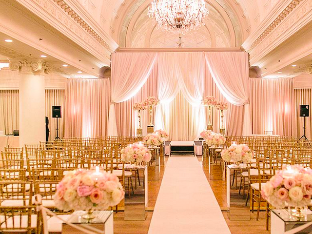
It's a great example of achieving the best design by creating tension between elements. Imagine you’ve bought a lovely century house with beautiful coffered ceilings and while you want to honor the history of the home, your personal taste is more modern. How do you marry these things successfully? In broad strokes, my trick is to keep (or even add) more authentic primary components of the house, such as: restoring the original baseboards, doors, ceiling details, architectural features… any part of the house itself. Then the way you fill the house, such as: lighting details; furniture; cabinetry; plumbing fixtures can be more modern.
Of course playing with this formula also allows some creative license that can create some very dramatic spaces like the King Eddie ballroom. Aside from dramatic effect, functionally speaking coffered or tray ceilings can offer some practical purposes to like providing a clever way to hide structural beams, ductwork or plumbing. These also serve to delineate zones in open concept spaces.
Hawksworth Restaurant and Bar, Rosewood Hotel Georgia, Vancouver

The ceiling at Hawksworth cocktail bar feels like a sculptural piece that might have well been inspired by 'starchitect' Frank Gehry. Its organic flow has a feminine appeal that plays well against the very structured masculine clad walls and dark wood floor. But what makes this ceiling really sing, is the use of lighting to accentuate its sensuous folds.
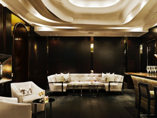
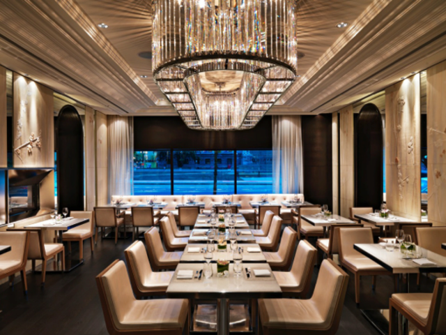
The Pearl Room at the Hawksworth, which is adjacent to the cocktail bar, employs an entirely different ceiling technique. The linear lines created by the applied moulding acts to frame the enormous contemporary crystal chandelier. The color palette in both rooms is the same – rich chocolate brown and cream, so the flow between the rooms works, but the experience is each is unique in large part due to the ceiling design.
We are experiential beings interacting with our built environment. Inspiration is all around us. When you travel around the world or around the block, look around – and up! – for inspired design.
(A version of this article was published previously; Cruise and Travel Lifestyles Magazine).
Start your Trip!
Copyright BestTrip.TV/Influence Entertainment Group Inc or Rights Holder. All rights reserved. You are welcome to share this material from this page, but it may not be published, broadcast, rewritten or redistributed.